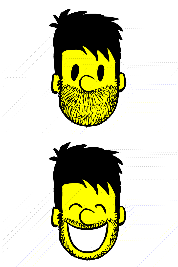

I really had no idea for a title for this one
Another TV doodle.
For this one though, I' posting two versions. One with just the line drawing, and the other with some photoshop touches added to it.
Which do you prefer?
Also.
Check this guy out.
http://thecolourplouffe.blogspot.com/
Benjamin Plouffe is hi name. A phenomenal young artist and a friend of mine!

5 comments:
salut,
t'es plutôt prolifique comme type.
je trouve tes dessins superbes.
merci
@+ sur ton blog
le capt'
Great stuff Pascal, personally I like the touched one up better just for the bit of depth that it gives.
I agree with Crylic - the increased value range of the retouched version establishes a stronger visual heirarchy. This makes it easier for me to read and understand the image. Plus, there's more depth! ;-)
Yup.. Thanks guys. Everybody seems to agree.
Captain Bothari.
Merci!
(^_^)
I also prefer the Photoshopiated one. More readable. Even thought there is something to be said for the raw roughness of the line drawing, which gets a tiny bit lost with the perfect computer gradients, IMHO.
Post a Comment